Using real data in our design tools

There is a whole heap of software and tools being created at the moment to try and bridge the gap between design and development. Being able to showcase your work as close to how it will look and function when it ends up in the hands of your users is really valuable.
When I recently joined Echo, I quickly realised that I had created my own version of Lorem Ipsum, and this was the medicine names and data I defaulted to using in my design work. Our patients can have thousands of different types of medicines yet I kept defaulting to Paracetamol or Co-codamol when trying to flesh out designs with real content.
We refer to specific medicine, form factors and quantities within our design work quite a lot, and I wanted to be able to stress test new patterns with real medicine information to ensure I wasn’t just designing for a simple use case, but more complex content would work as well.
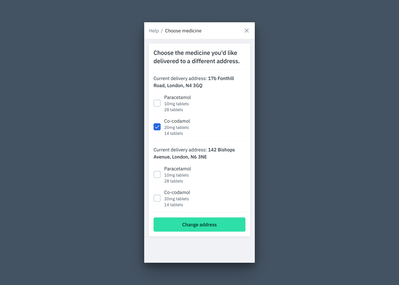
On a hack day, I decided to try and look for ways in which we could bring real data into our designs in Figma. When searching around I quickly found that people had built some useful plugins to try tackle this problem. I wanted to try and test a lightweight solution and ideally something that wasn’t too intensive to fit into our design workflow.
I found a Figma plugin called Google Sheets sync, which pretty much does what it says on the tin. It allows you to sync data in a Google Sheet with specific layers in your designs. It was built by Dave Williames, a Designer and Developer based in Australia. You can read more about how the plugin works here.
I got to work creating a Google Sheet filled with data from different medicines. I realised I needed to populate it properly and found that another designer on our team had an extensive list of medicine items, form factors, quantities etc. He kindly helped me populate the Google Sheet and we ended up with a pretty extensive list of medicine available through Echo.
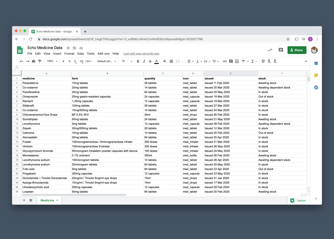
Jumping into Figma I took a card from a flow I had been working on recently and started renaming the layers according to columns in the Google Sheet. Adding a ‘#’ and then the column name signals to the plugin where the data should be synced in Figma, and which column it should sync with from the Google Sheet.
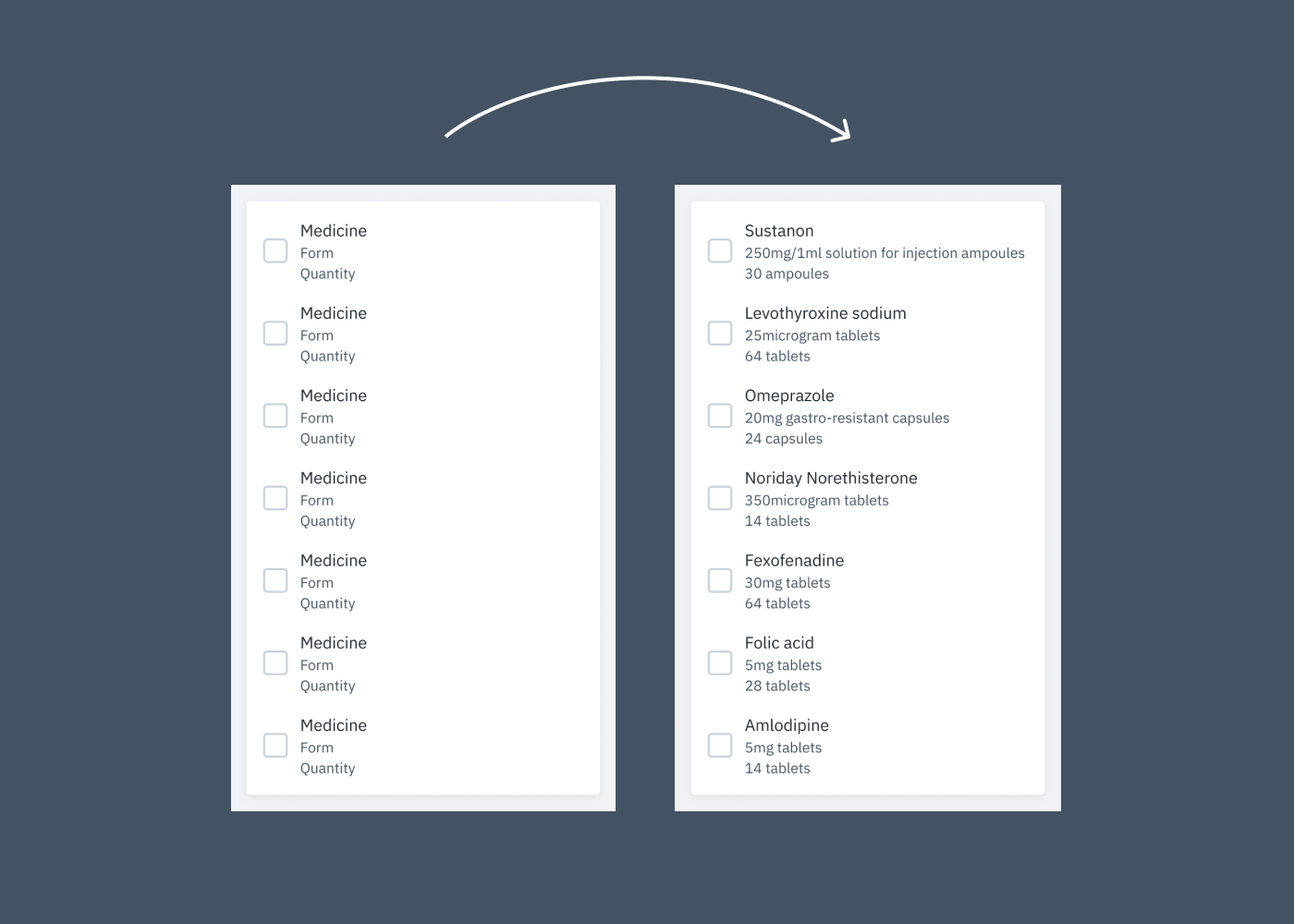
By default it was pulling the data in a sequential order, which meant every time the plugin was run, the same data set in the same order was populated in the designs. Fortunately this is accounted for in the plugin and appending a parent frame or group with ‘.x’ brings in a random index each time.
The result worked well and it brought in different medicine details each time the plugin was run, allowing us to quickly and easily stress test our designs.
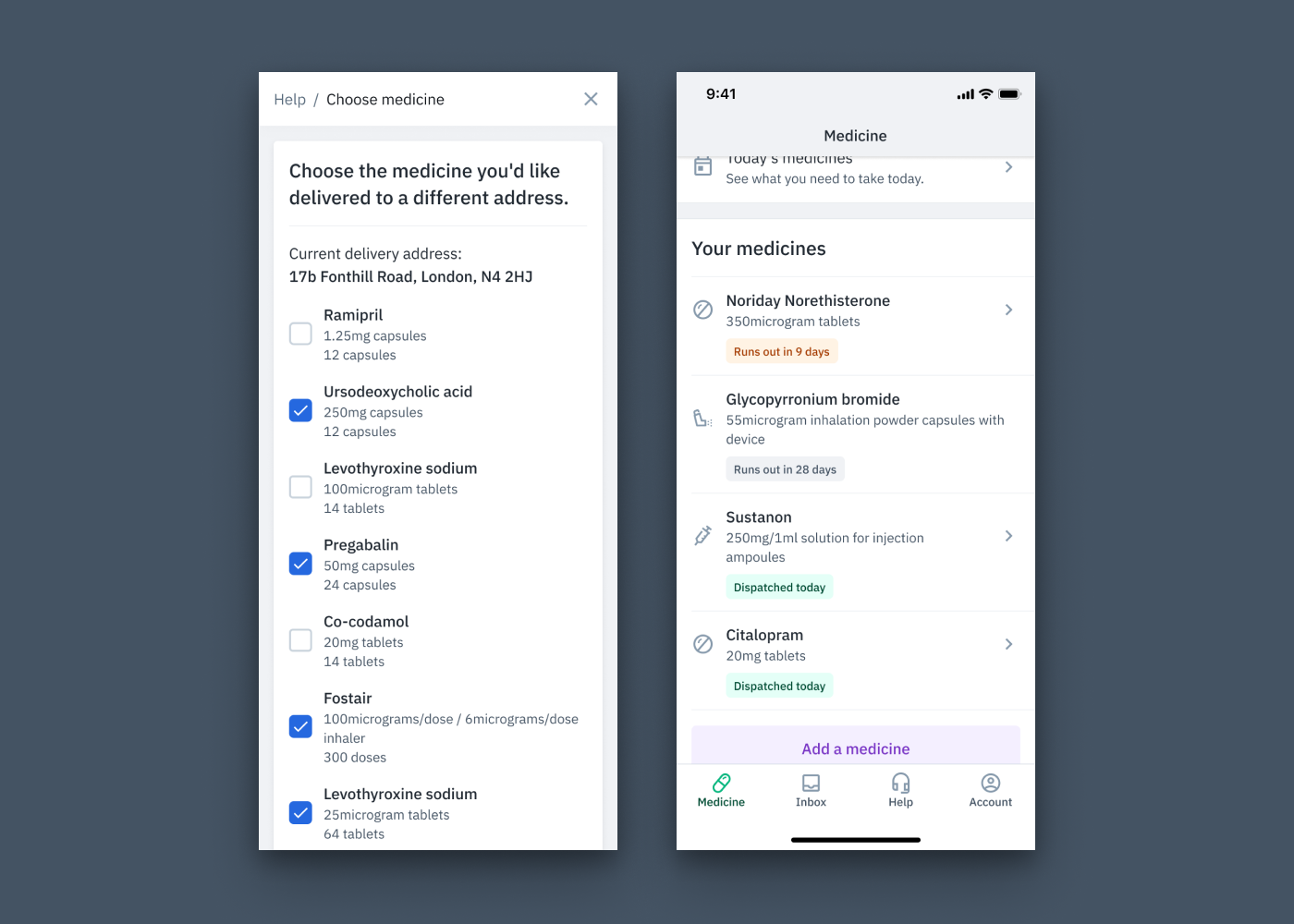
We also use a custom icon font with all our medicine iconography, so if you type syringe while using the icon font, you automatically get the icon populated in the text box. This meant that we were even able to select the correct iconography within the Google Sheet, and just sync it where necessary. Our medicine icons are tied to specific medicines, so this was really helpful to have in the workflow.
It’s only a small step but it has definitely helped bring my designs closer to the environment in which they will be viewed by our patients. I have started using this workflow across multiple projects and it has made it really easy to start stress testing designs over different platforms with actual medicine data. We are taking some early steps to see how we can tackle this with other content at Echo.
Follow us on @BuildingLloydsD